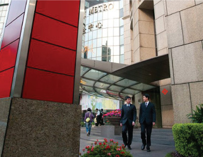
Far Eastern International Bank (FEIB) calls for new corporate identity after its acquisition of Chin Fon Commercial Bank - 19 branches in Taiwan.
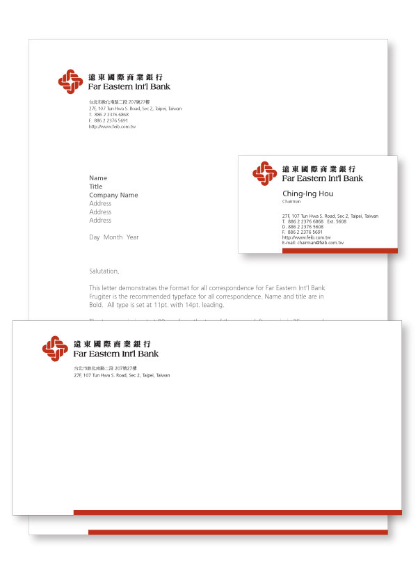
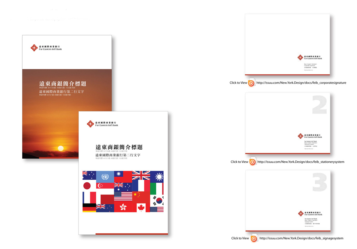
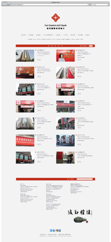
The creative for the new corporate identity, We shortened the brand name and makeover with more easy-to-read font type. For the symbol darken the original red reflected FEIB its satiability and reliability. Together the new type arrangement with new imagery and corporate colors, will feature on all marketing collateral, such as stationery, stationery related, signage and branch signage and literature.
Michael Lamson of New York Design, says: "We have longstanding working relationship with Far Eastern Group. We done the first and original FEIBs corporate identity back to 18-year ago as well as the Far Eastern Plaza the mall and the office complex. This is the first time we have undertaken a rebranding exercise in this nature. It demonstrates New York Designs ability to provide its clients with a full integrated marketing communications offer."