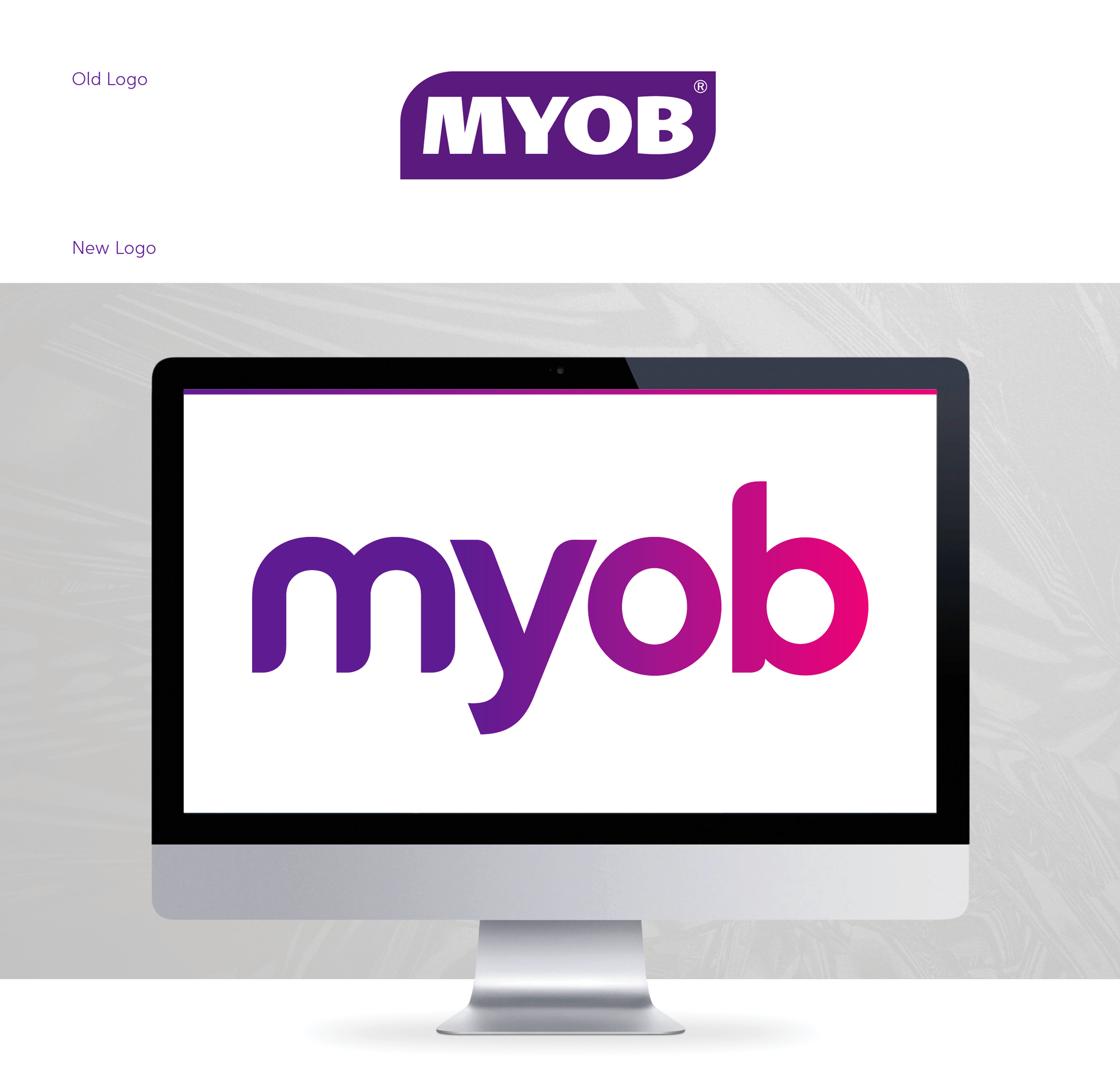
MYOB is the originator of digital accounting software in Australia and New Zealand and has been market leader for the last 26 years. Due to a strong increase in category competition and a visual brand disconnect with their progressive internal culture, Derringer was approached to help solve a complex business issue with the MYOB team and refresh this iconic Australian tech brand.
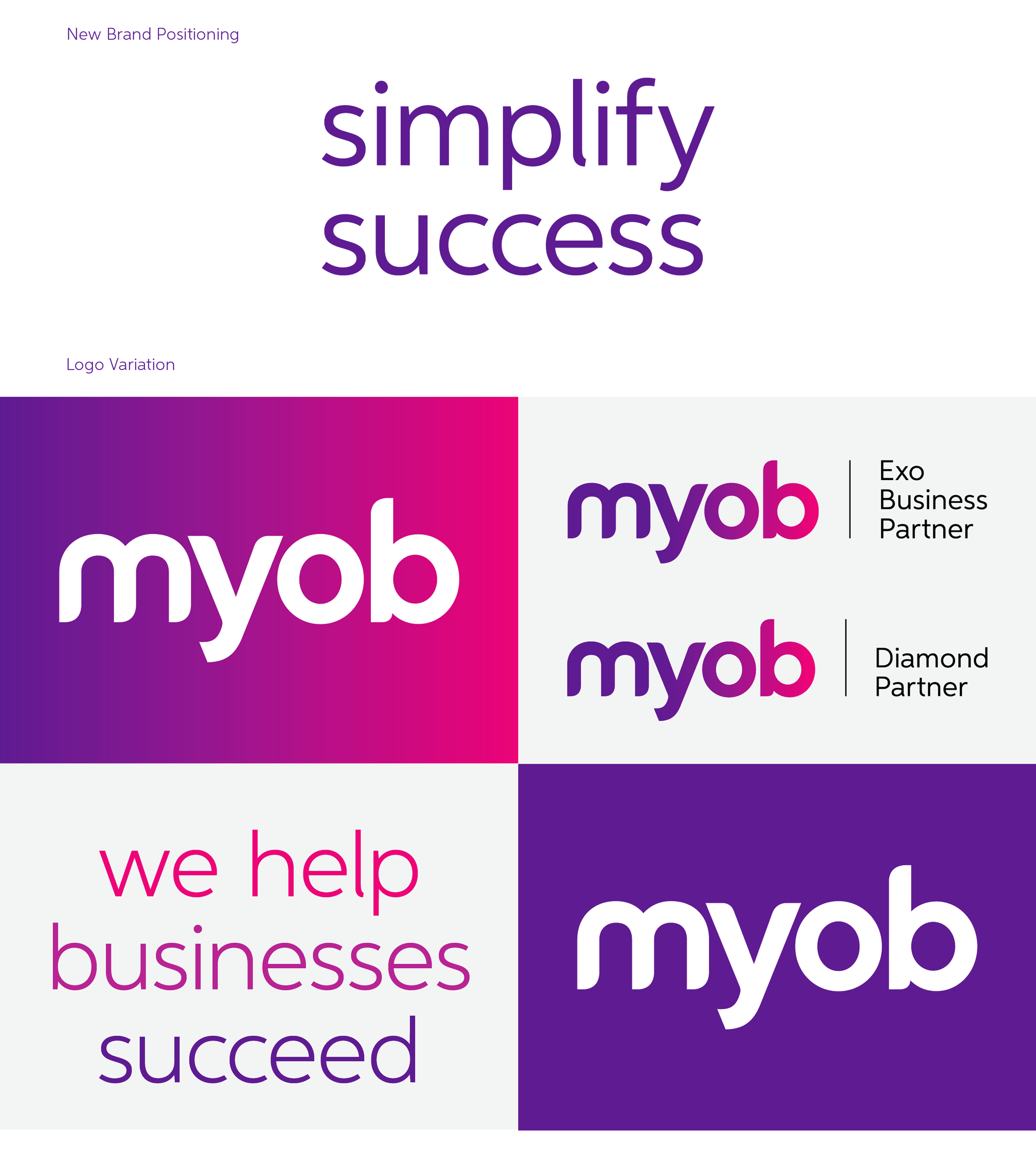
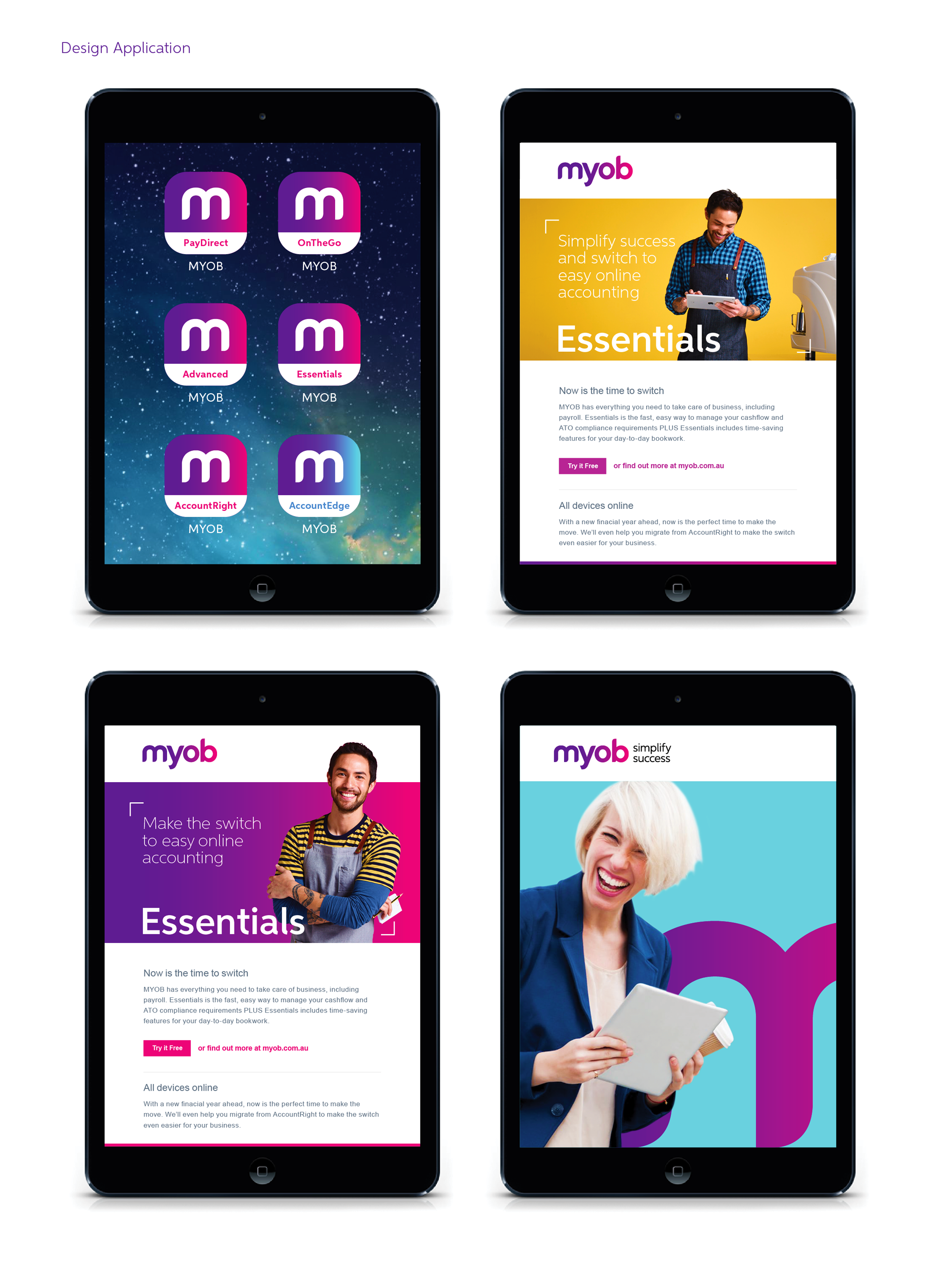
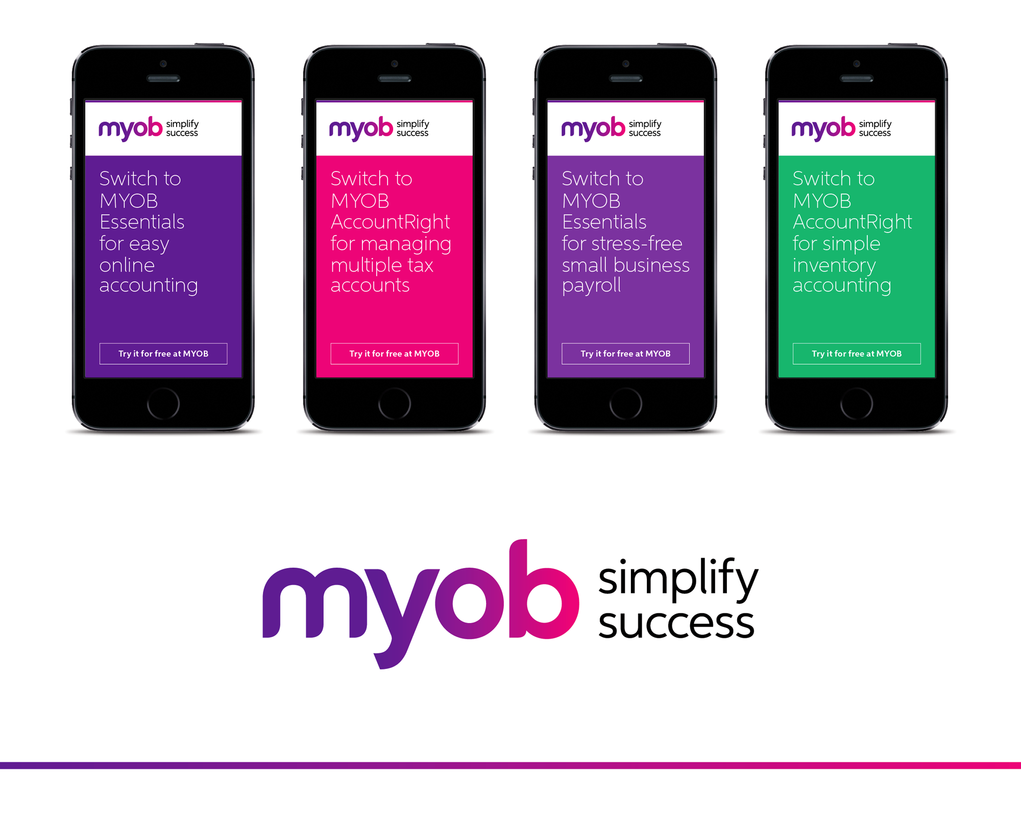
Our approach was twofold: Firstly, to redefine their brand positioning: We created the powerful statement of ‘Simplify Success’, which resonates strongly with the company philosophy of ‘helping businesses succeed’. Second, to create a brand that distilled the complexity of MYOB’s product offerings across all its touch-points in a simple, compelling way for all customers.
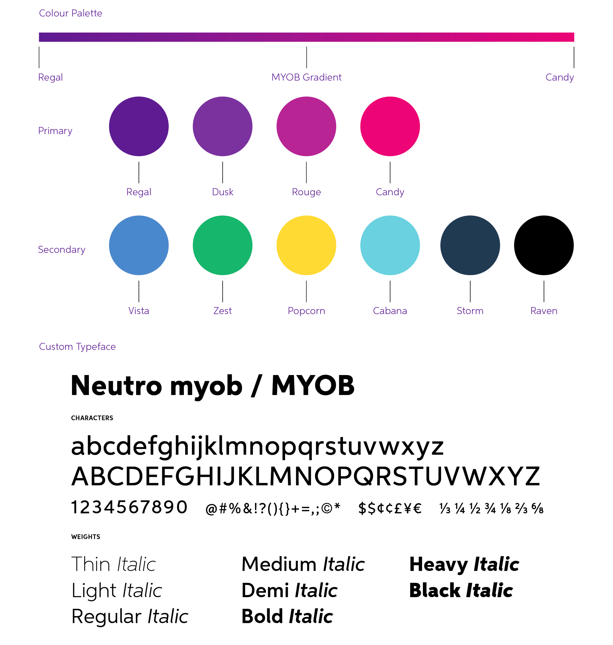
Derringer redesigned the original logo – breaking it out of the confined lozenge shape it has been housed in for decades – and created a bold, recognizable word-mark. The new typography is custom designed and presents stronger, friendlier lowercase letter-forms that highlight the energy and vision of the current MYOB internal culture and product offering. The colour palette was refreshed to be more vibrant while retaining a revised version of the unique ‘MYOB’ purple which holds a significant amount of brand equity for the company.
Finally, we introduced the ‘MYOB Gradient’ to signify an obvious evolution of the brand. This represents a vivid progression from old to new and provides a playful and bold injection of colour to the new identity which reflects the brand and distinguishes MYOB from its competitors.
www.derringer.com.au