We created a new visual identity for Sudarshan, the largest pigment producer in India to reflect Sudarshan's core values of innovation, excellence, quality and affordability.
Emphasis was placed on the Sudarshan name to become the single face of Pigments, Speciality Effect Pigments, Agrochemical and Environmental Management.
The new identity helps to integrate the business units Sudarshan operates and focus on its core business while moving the identity away from the perception of a chemical company and simplifying and reinforcing the heirarchy of the single brand.
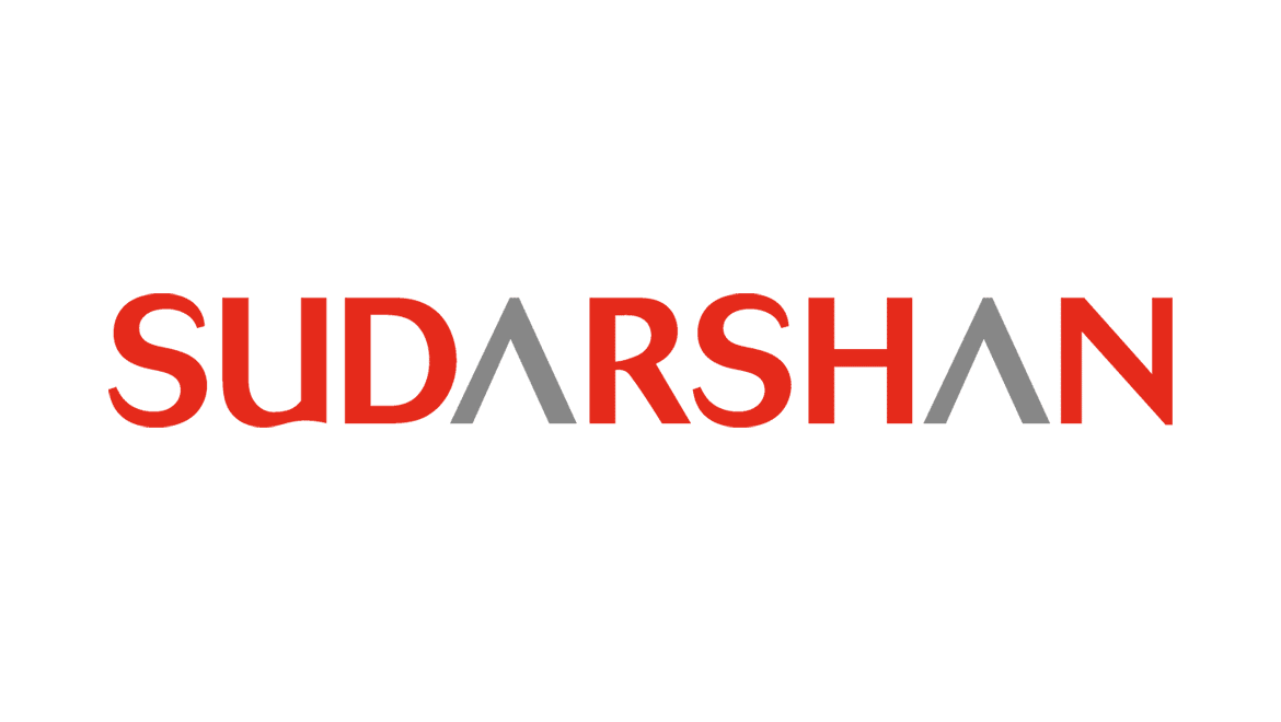
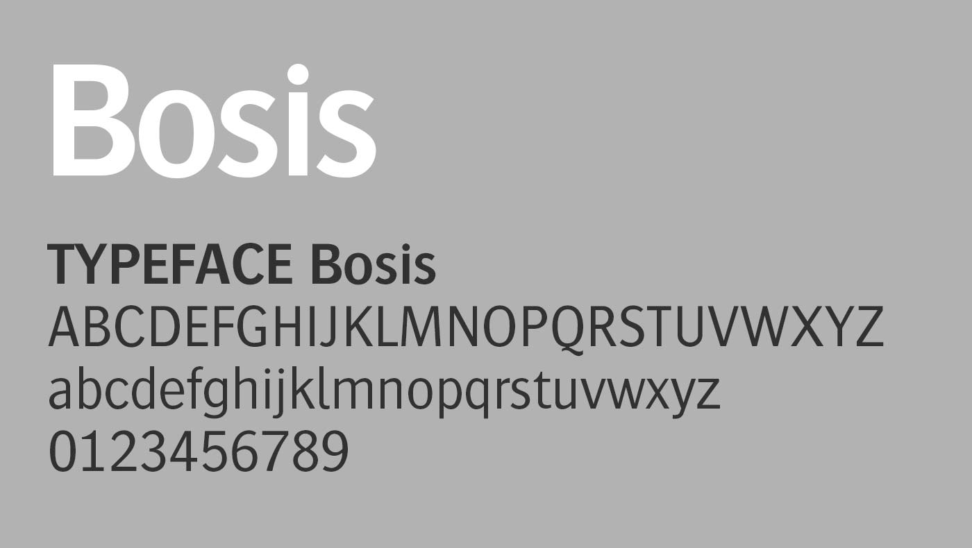
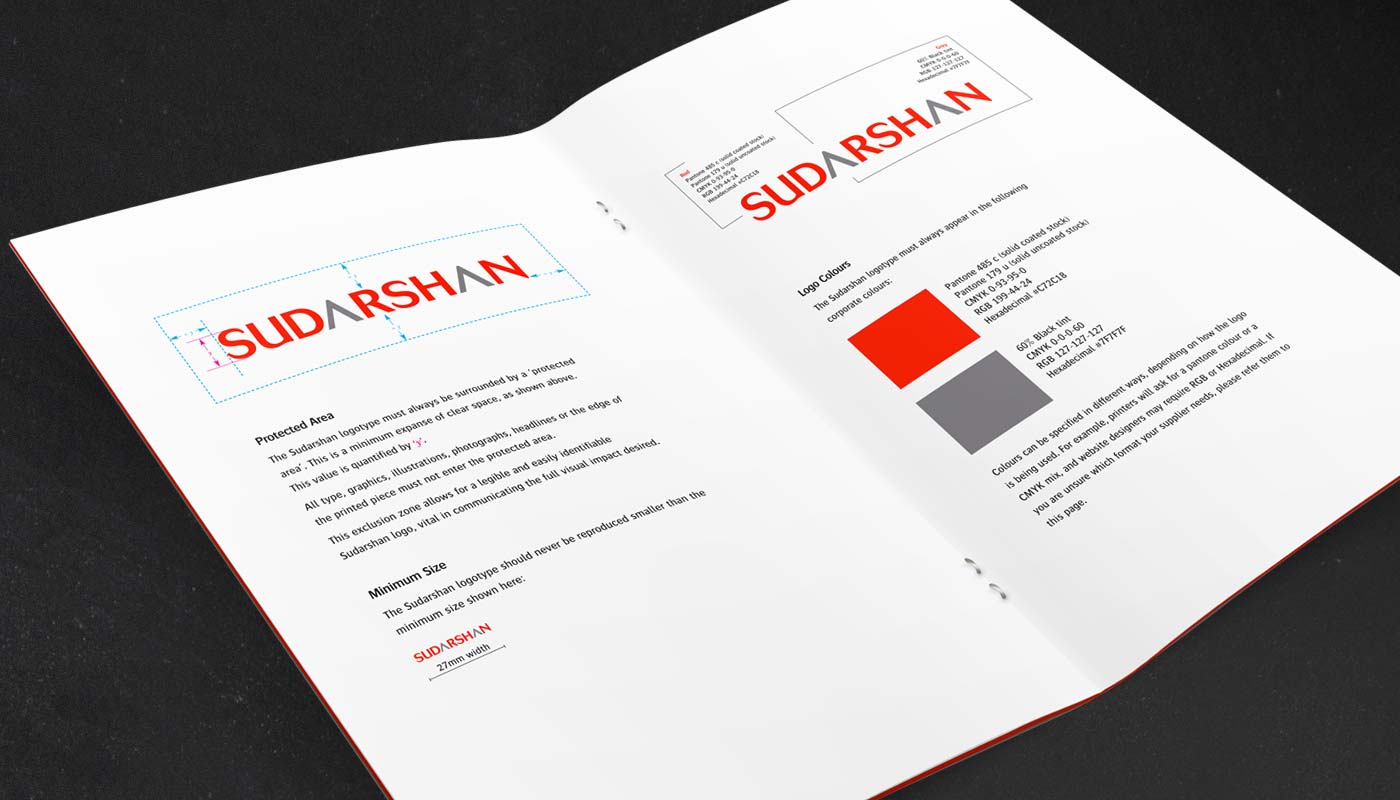
A customised sans-serif typeface was chosen for the Sudarshan logotype as it is both clean and approachable. Strong angular letterforms combined with soft curves give the mark a stable and friendly face. The Sudarshan logotype symbolises change, continual improvement and attention to detail while capturing Sudarshan's pioneering qualities and 'leading the way'.
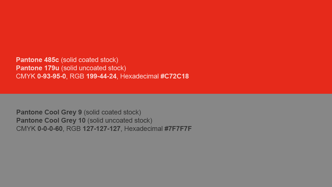
The Sudarshan logotype appears in red and grey. Red was selected for it's visibility, vibrant leadership and energetic qualities and the neutral grey creates contrast and space and forms a stable base tone for use in Sudarshan's literature.