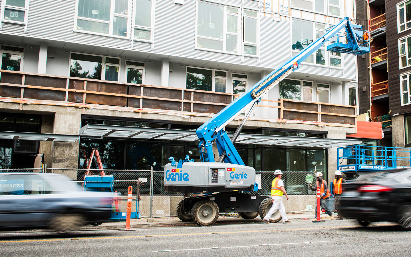
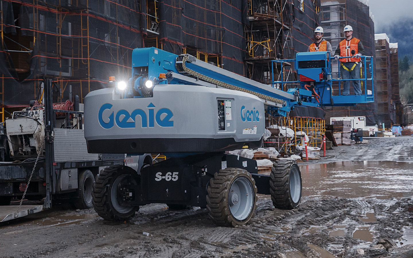
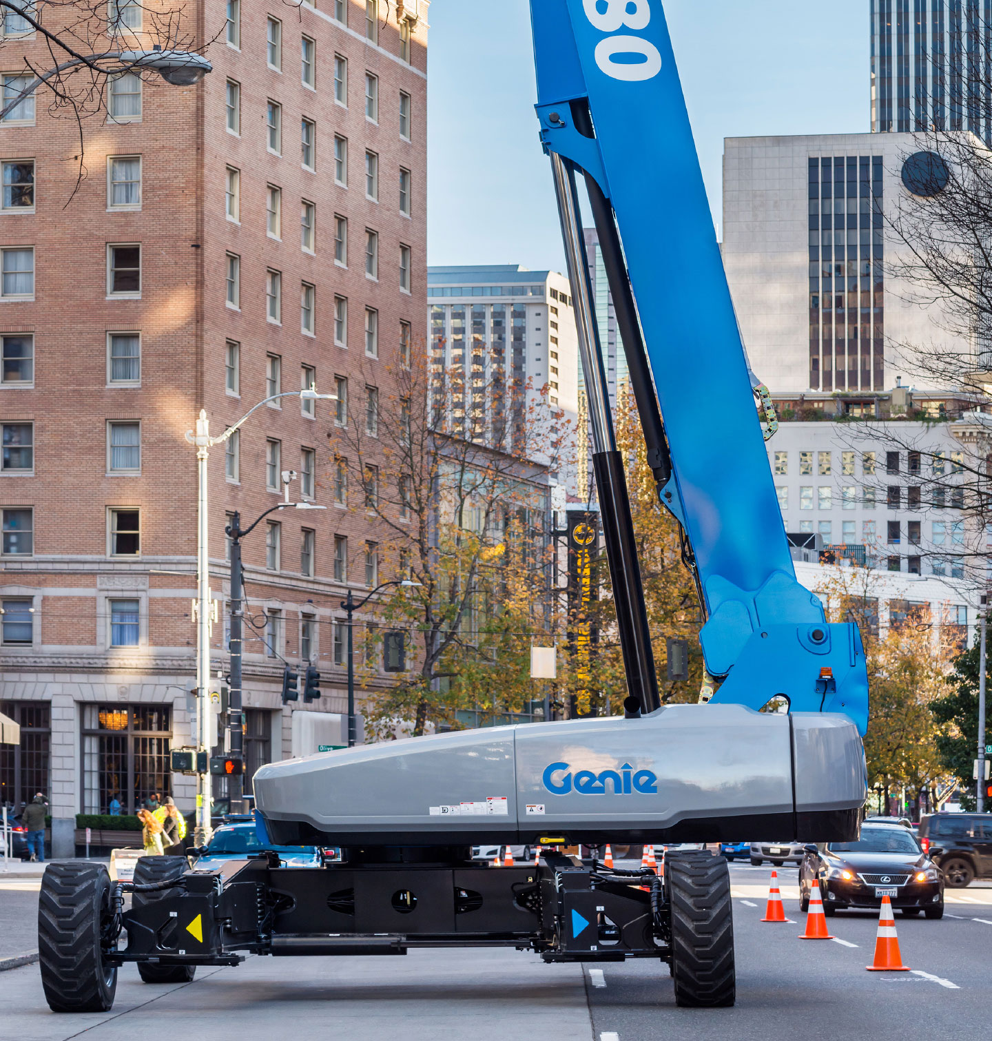
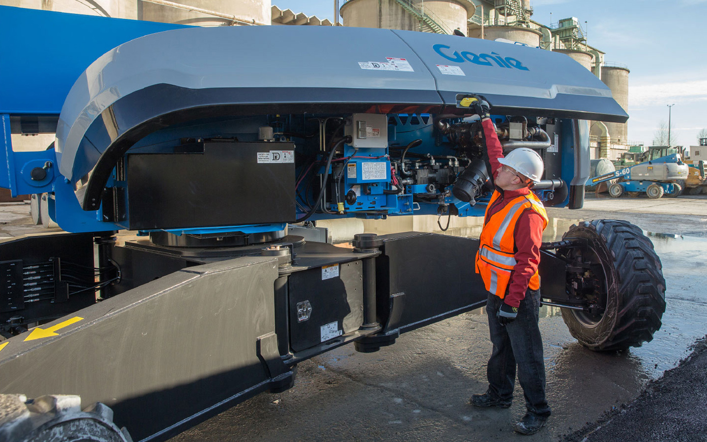
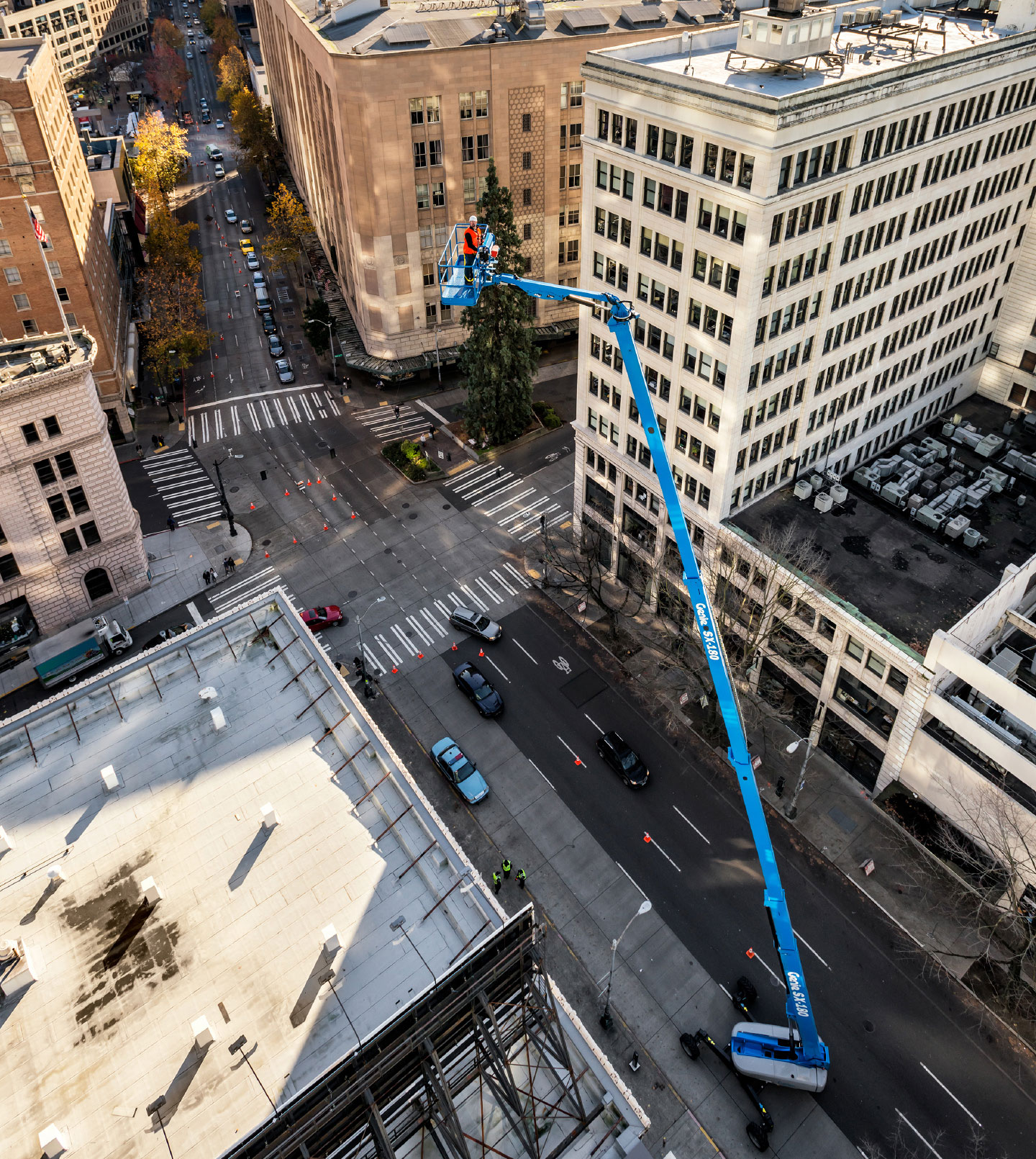
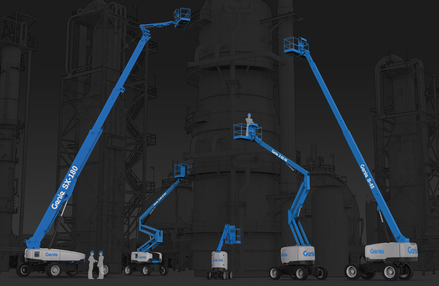
Genie manufactures lifts and platforms used in construction, maintenance, warehouse stocking, and equipment installation. They produce machines that set the industry standard for quality, reliability, and safety; those values are the cornerstones of Genie’s brand legacy. To elevate and bring consistency to the brand, Tactile updated the visual language on all their lifts, considering everything from housing form factor and graphics to overall color of the machine.
We wanted to tell the story of reliability and safety that is integral to the DNA of Genie’s product family. Trust is critical for professionals who spend their workday in a lift high above the ground; that trust is the legacy of the brand. Our goal was to modernize the look and feel of Genie products with timeless designs. The new machines needed to look even more capable and trustworthy than the last Genie product they used.
The new visual brand language represented a major aesthetic shift. For the first time, black—not blue—is now the standard color of each machine’s base. Blue is Genie’s signature brand color, and to strategically protect their legacy, it meant removing the blue color from the area that receives the most wear, the base. By incorporating blue in more strategic, intentional areas, it would become more prominent. Black—as opposed to another color, like grey or white—was important for the base, because it shows dirt less and can be easily touched up or repainted. It also gives the appearance of a sturdy, solid foundation. It was important to connect the appearance of the machines to the overall product story for the company. We kept blue on the logo and the arm to reinforce the brand and symbolize the Genie mantra: Blue is the color that lifts.