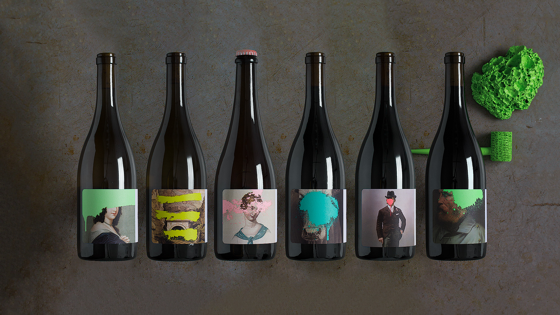
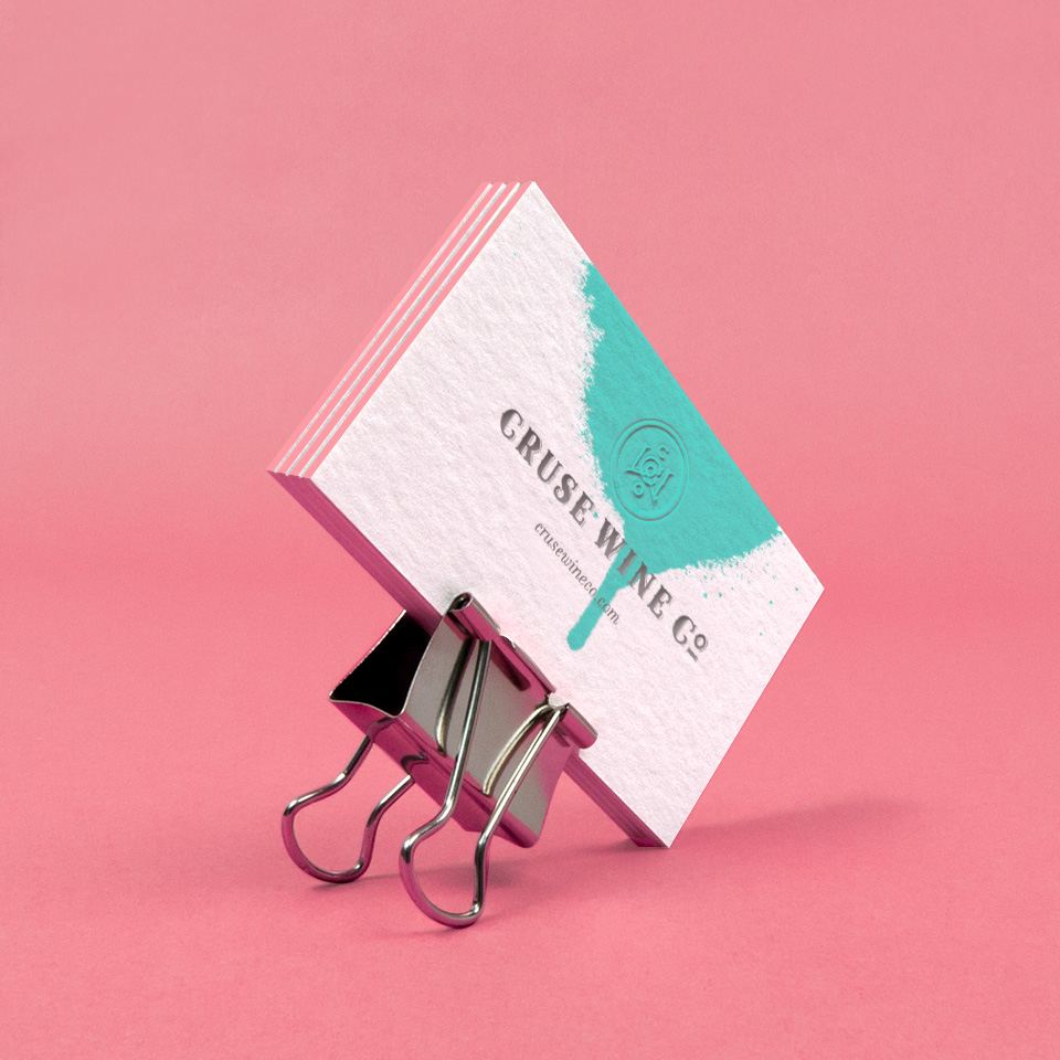
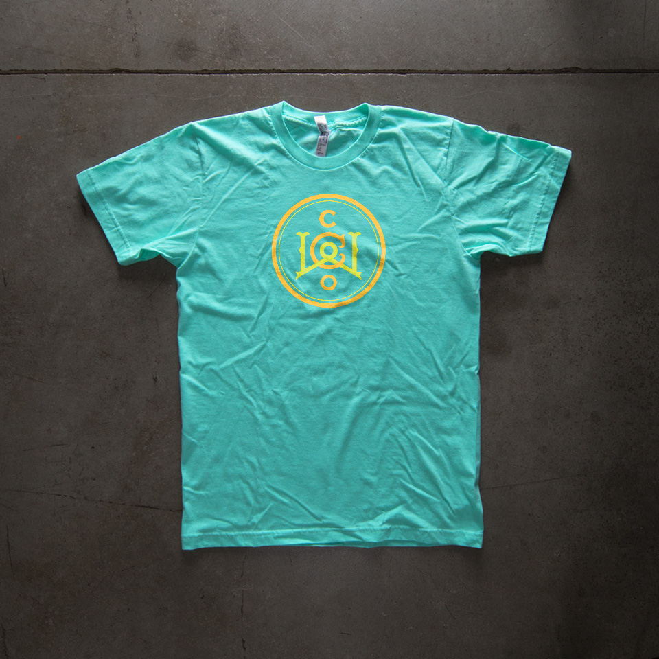
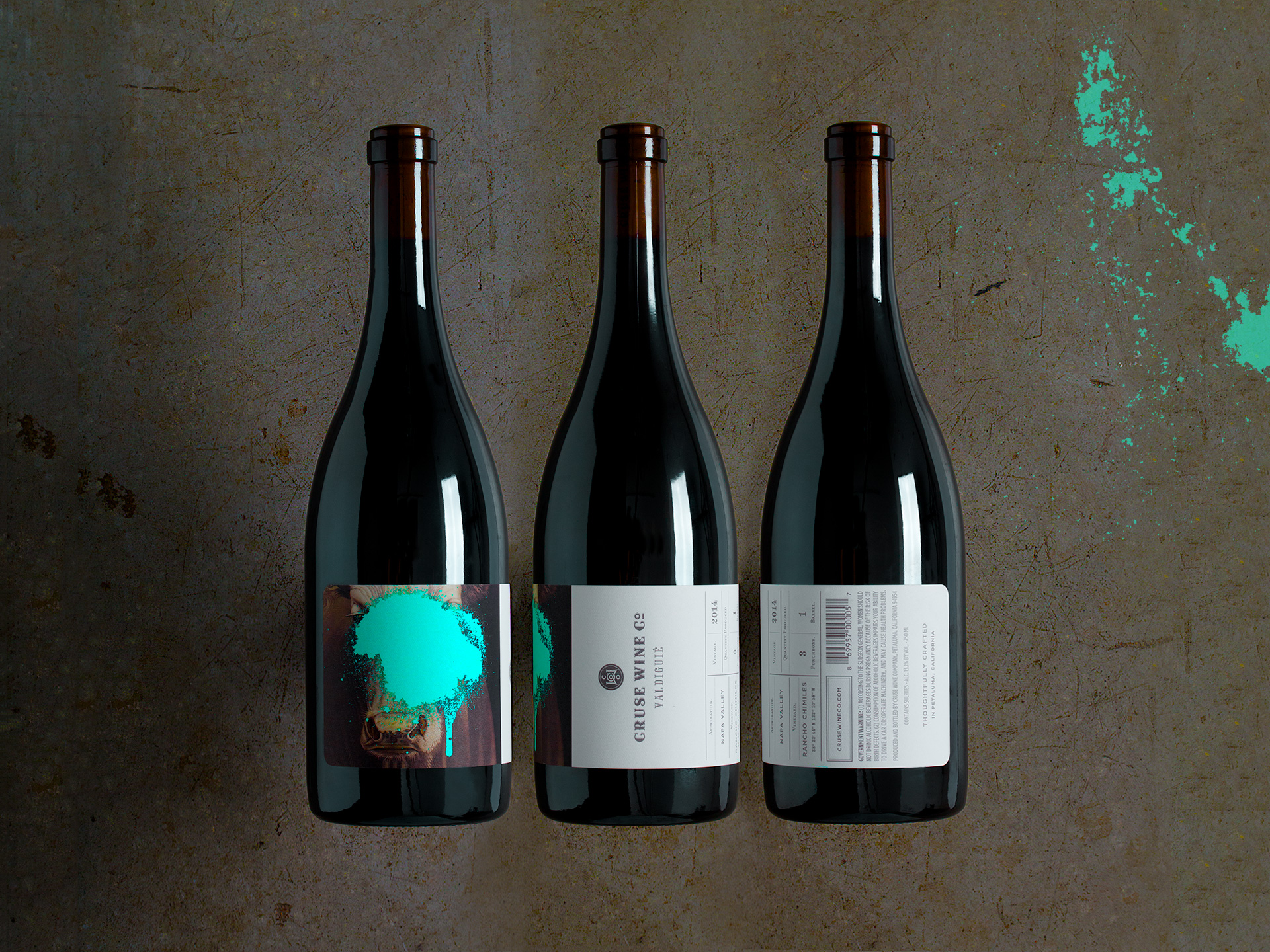
With the continued proliferation of boutique wines, it has become increasingly more important for producers to embrace packaging that is more expressive, singular and atypical. Drawing on the wine-maker’s maverick attitude, we developed a provocative brand identity that retains a tradition of elegance while simultaneously reflecting a revolution in contemporary standards. Antique engravings are obscured by vivid neon colors, creating considerable impact at a distance. However, plenty of compelling features manifest at close range. A slight rotation of the bottle reveals an elegant typographic palette, which borrows traditions normally found in the spirits category. The logotype is suggestive of a family monogram and further reinforces the quality expected from today’s premium products. The results are labels that exude a coy playfulness, each being an invitation to experience the seemingly ordinary within new contexts.